The Cutting Table · compared on the table
The listing photo and the color chart look different. Which one is accurate?
Also asked as:looks creme in this photo but almost blue on chartwhich photo is more accurate
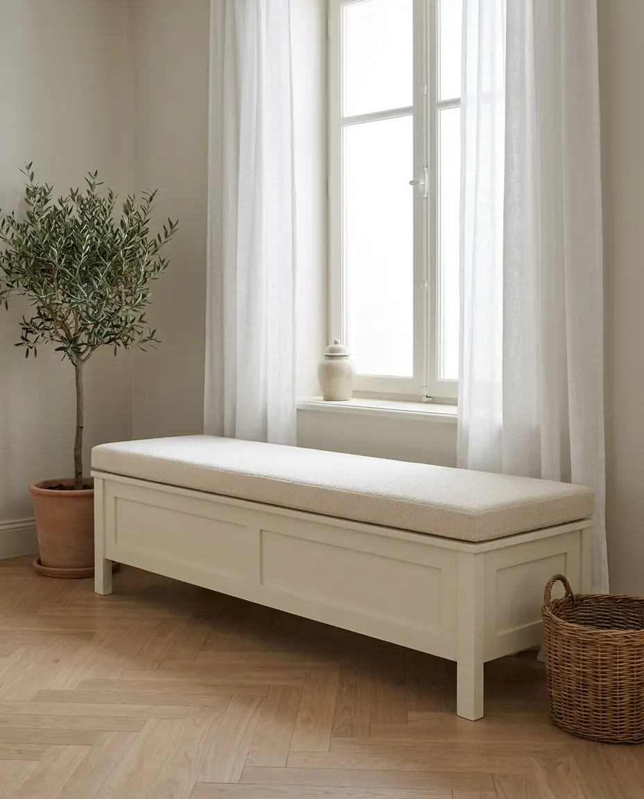
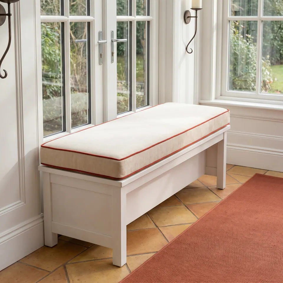
One fabric, two lights, two stories. I have watched a warm oatmeal turn dove gray between a lamp and a north window, my friends.

 Save
The quick answer
Usually both are accurate: they show the same fabric under different light, and on the bench-cushion ranges the color chart is the better guide. Warm light pushes fabric toward cream and beige; daylight or white indoor light makes it read grayer and cooler. Before production the workshop sends close-up photos of your chosen fabric, so you can still switch codes.
Get a quote for a bench cushion
Three lights, one fabric
| Where you see it | What the light does | How far to trust it |
|---|---|---|
| Styled listing photo | Warm lamps push it toward cream and beige | Good for mood, weak for exact tone |
| Photo in daylight or white indoor light | Grayer and cooler; terracotta can drift pink | Closer, but your screen still has a say |
| The color chart | Fabric beside fabric, shot flat | Yes The better guide on bench ranges |
| Close-up sent before production | Your exact code, photographed for you | Yes The last check; you can still switch |
On some floor-cushion linens it runs the other way: two chart swatches photograph darker, and you receive the product-photo color.
Key facts
- Listing photos shot under warm light bring out cream and beige tones.
- Daylight or white indoor light makes the same fabric read grayer and cooler.
- On the bench-cushion ranges, chart colors are more accurate than styled listing photos.
- A terracotta that looks pink in one shot is still terracotta; an outdoor fabric that reads red can be an orange tone.
- Close-ups of your chosen fabrics come before production, and codes can still be changed.
- Where a sample and a photo disagree, the workshop asks which color you want and makes that one.
- Physical swatches are about 4 x 4 to 6 x 6 in, large enough to judge a color in your own room's light.
- The outdoor range spans about 150-200 colors, and a red-looking outdoor fabric can read orange in daylight.

Have it made
Have Élodie’s workshop cut this for you
Describe the room at four in the afternoon: the floor, the wall, the one color you love. That is where a good fabric choice begins. — Élodie
Leave your details and the workshop will call you to confirm measurements, fabric, foam and piping. No prices, dates or payment on this page: it is a request, not an order.
Why a cream can look almost blue on a chart
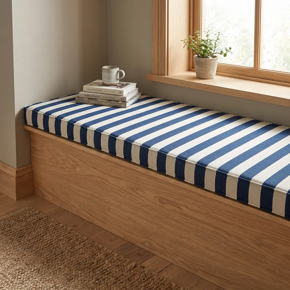
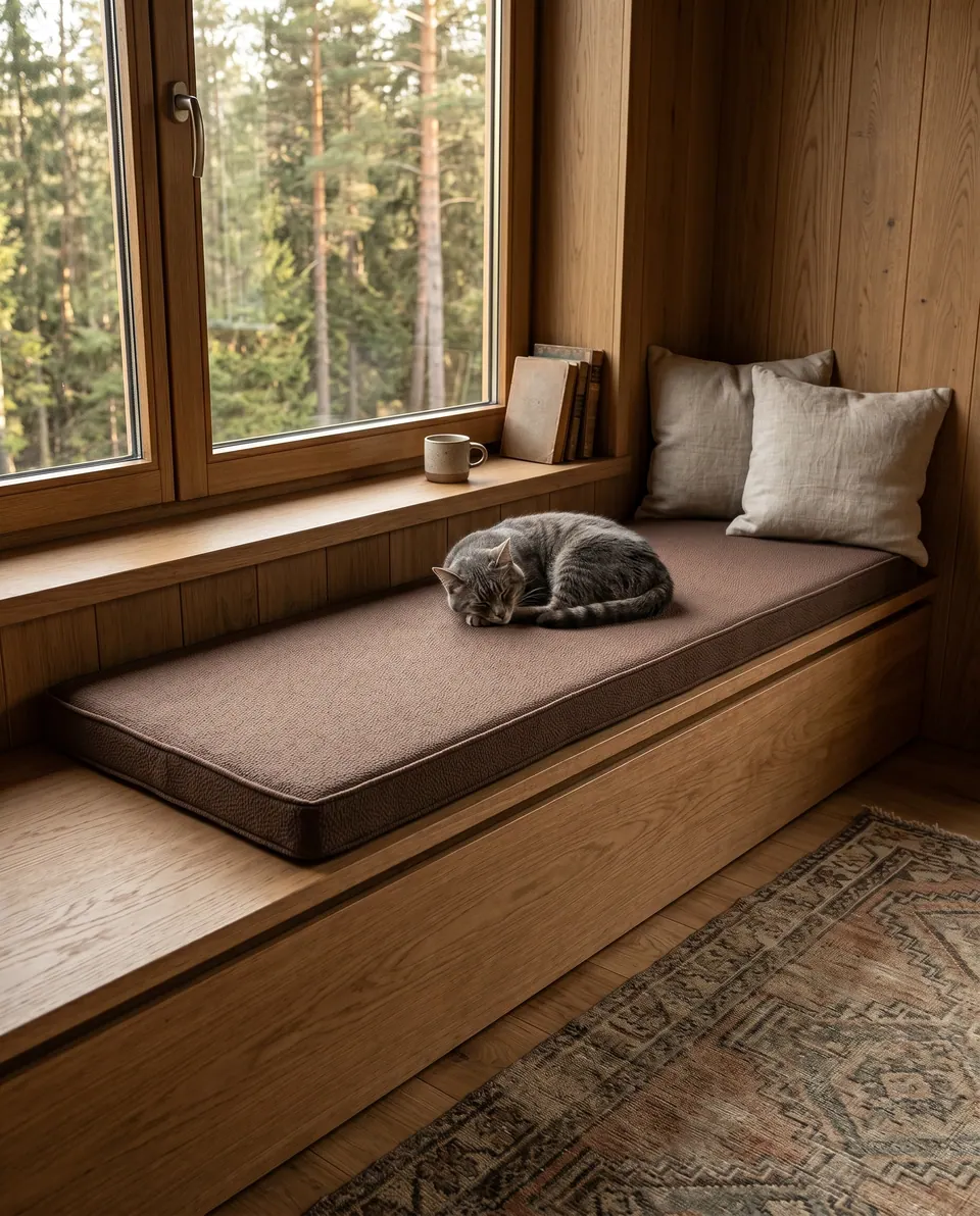
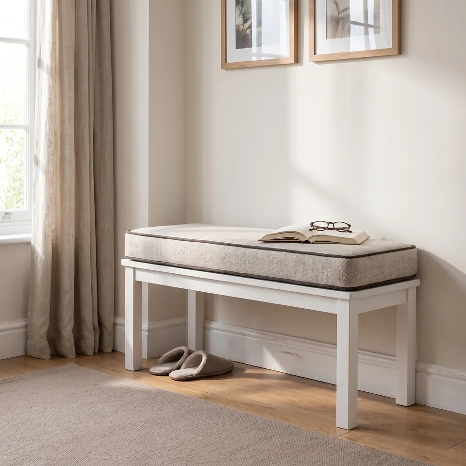
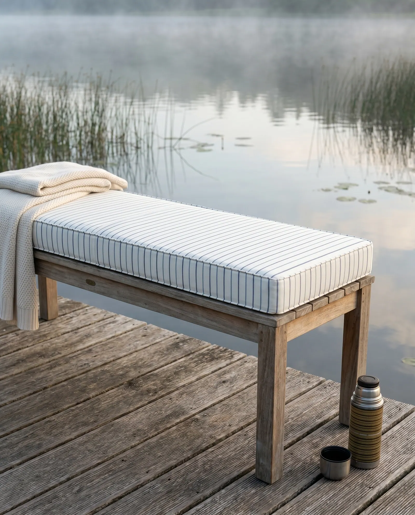
A listing photo is staged: lamps, low sun, oak and linen, all of it pouring honey into a pale fabric. Shoot that same cream in cool light and it shows its gray bones. Neither picture lies; they were taken in different weather.
Daylight never lies; your screen sometimes does. So the chart wins on the bench cushion ranges, and a swatch in your own room settles more than any photo (screen vs daylight goes further). Which light will your cushion live in: a north window or a lamp-lit corner?
A listing photo shot under warm lamps makes cushion fabric look creamier; the same fabric in daylight reads grayer. On bench ranges, trust the color chart.
Élodie
Buyer questions
- A common question
The fabric looked cream in the listing photo, but on the chart it looks gray, almost blue. Which is right?
The workshop's answerIt comes down to light. Listing photos were taken under warm light, which brings out cream and beige; in daylight the same fabric reads grayer. The chart is the more accurate guide, and photos of your chosen fabric come before production.
- A common question
The swatch looks pink but the listing says terracotta, and an outdoor orange looks red to me. Which is true?
The workshop's answerBoth photos are honest: one was shot in daylight, the other under white indoor light. The terracotta is not pink, and that outdoor fabric is an orange, not a red. When in doubt, the workshop sends a close-up.
- A common question
My sample looks lighter than the photo. Which color will I get?
The workshop's answerThe one you confirm. After purchase the workshop asks whether you want the photo color or the chart color. Mint, for one, runs a little lighter than in some photos.
- A common question
I want the exact floor cushion in the listing photo. Which color number is that?
The workshop's answerAsk first. Similar shades carry different numbers, so the workshop names the one in that photo.
Questions buyers ask next
Why does a cushion fabric look different on my phone than on my laptop?
Every screen is tuned differently for brightness and warmth, so one photo shifts from device to device. Close-ups of your actual code, and a sample in your own room, are the surer checks.
Can I change my fabric code after I place the order?
Yes, before production. Photos of the fabrics you chose are sent to you first; if the tone surprises you, switch codes then, before anything is cut.
Which cushion colors are hardest to judge from a photo?
Pale neutrals and soft pastels: creams, beiges, grays and mints. Warm light turns them creamy and cool light turns them gray, so a chart, a close-up or a sample matters most there.